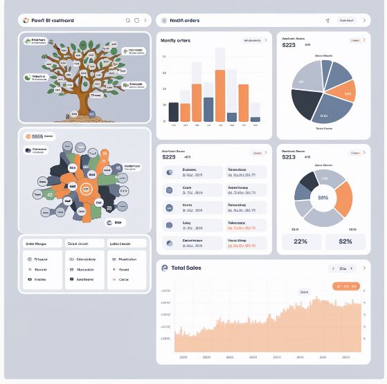
Light AutoML plots: A Visual Guide to Your Machine Learning Journey
Light AutoML is a powerful tool that simplifies the machine learning process, making it accessible to a wider range of users. One of its standout features is the ability to generate informative visualizations that help you understand your models and make data-driven decisions. In this article, we’ll explore the various plots generated by Light AutoML and how to interpret them effectively.

Understanding Light AutoML Plots
Light AutoML offers a variety of plots that provide insights into different aspects of your machine learning pipeline. Here are some of the key plots you’ll encounter:
- Performance Plots: These plots visualize the performance of your models over time, allowing you to track progress and identify potential issues.
- Loss Curves: Show how the loss function changes during training.
- Accuracy Curves: Display the accuracy of your model on training and validation sets.
- Feature Importance Plots: These plots highlight the most influential features in your models, helping you understand which variables contribute most to the predictions.
- Bar Charts: Visualize the relative importance of each feature.
- Heatmaps: Show the interaction between features.
- Confusion Matrices: These matrices illustrate the classification accuracy of your model, revealing how well it distinguishes between different classes.
- Distribution Plots: These plots display the distribution of your target variable, providing insights into the data’s characteristics.
- Hyperparameter Tuning Plots: These plots visualize how different hyperparameter values affect model performance, helping you optimize your model configuration.
Interpreting Light AutoML Plots
To effectively interpret Light AutoML plots, consider the following tips:
- Context is key: Understand the context of your problem and the meaning of the metrics being visualized.
- Look for trends: Identify patterns or trends in the plots that can provide valuable insights.
- Compare plots: Compare different plots to gain a more comprehensive understanding of your model’s behavior.
- Use visualization tools: Leverage tools like Matplotlib or Plotly to customize and enhance the visualizations.
Example: Interpreting a Loss Curve
A loss curve typically shows how the loss function decreases over time during training. If the loss is decreasing steadily, it’s a good sign that your model is learning. However, if the loss plateaus or starts to increase, it might indicate overfitting or other issues.
Conclusion
Light AutoML’s visualizations are an invaluable asset for understanding and improving your machine learning models. By effectively interpreting these plots, you can gain deeper insights into your data, identify areas for improvement, and build more accurate and reliable models.


One Comment